Lotus is steeped in history. For the last 71 years, the sports car company has been hand-building cars in Hethel, England, and every Lotus built over that seven-decade span has adhered to founder Colin Chapman’s philosophy of “simplify and add lightness.”
But things are changing quickly at Lotus. With new Chinese ownership, the firm is looking to the future and, to that end, will soon introduce an all-electric hypercar, called Evija, with nearly 2,000 horsepower. To better reflect that bold new future, Lotus has decided it’s time for a new logo. The company shared the new logo in a Thursday release.

New Lotus logo
The new logo’s shape is very similar to before—it consists of a quarter-circle contained within a larger circular outline. But Lotus has tweaked the logo's font to achieve the new look. The letters ACBC (which are the initials of the company’s founder, Anthony Colin Bruce Chapman) are now sans serif, as are the letters that form the LOTUS typeface. The word Lotus is now straight instead of curved to follow the arc of the inner quarter-circle. And the chrome-like outline is gone.

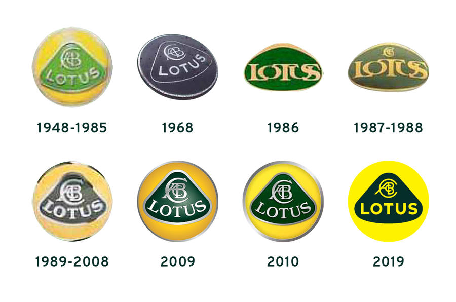
Lotus logos over the years
“We’ve looked back at the original Lotus roundel and thought about Colin Chapman’s philosophy—to simplify and add lightness,” Simon Clare, the company's Executive Director, Global Marketing said. “We’ve applied that to create a new roundel, taking the weight out of the lettering and adapting the spacing. We’ve also straightened the word ‘Lotus’ so it’s consistent with the Lotus wordmark.”
The introduction of the new logo was made in conjunction with an announcement that Lotus will be the chief sponsor of the newly promoted Premier League soccer team, the Norwich City Football Club. That multi-year partnership will see the Norwich City’s training facility and Academy renamed The Lotus Training Centre and The Lotus Academy.