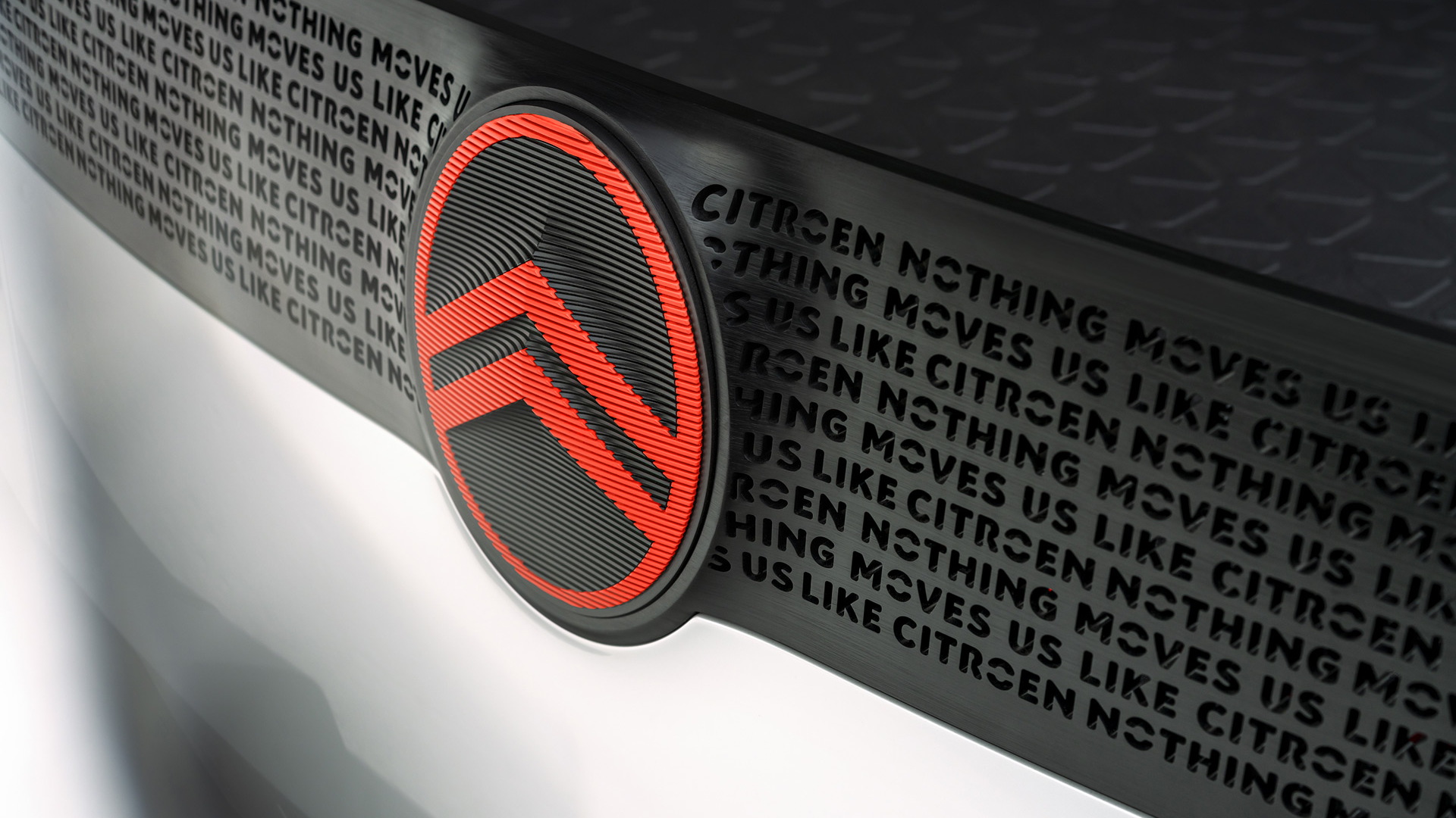
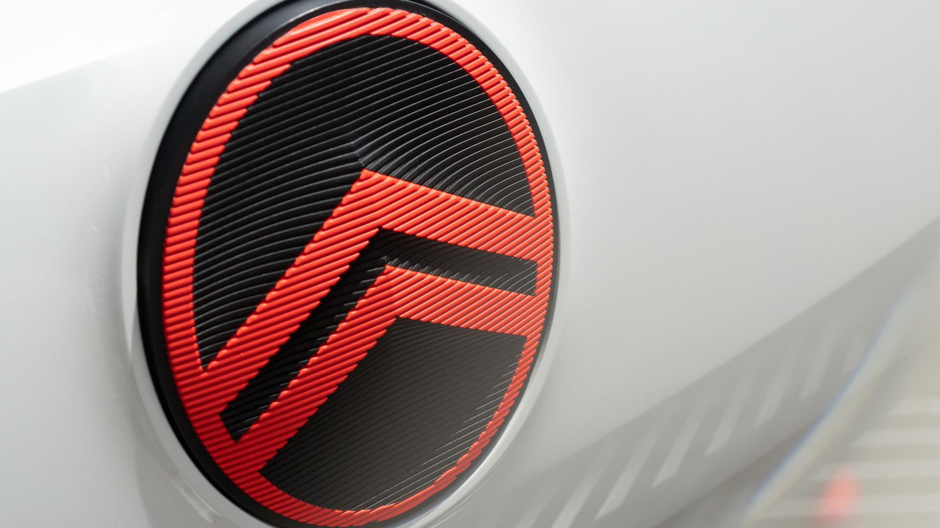
Citroën's famous chevron logo has been updated with a more modern look to better suit the digital world, and fans can expect to see the new logo start to appear on the French automaker's production cars and concepts from about mid-2023.
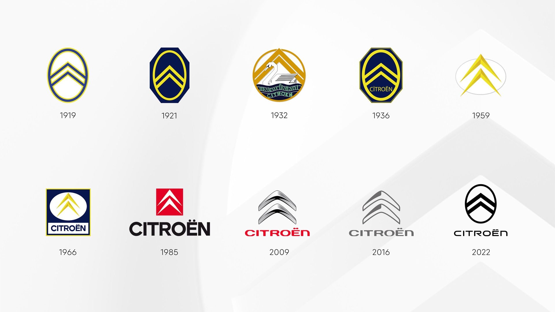
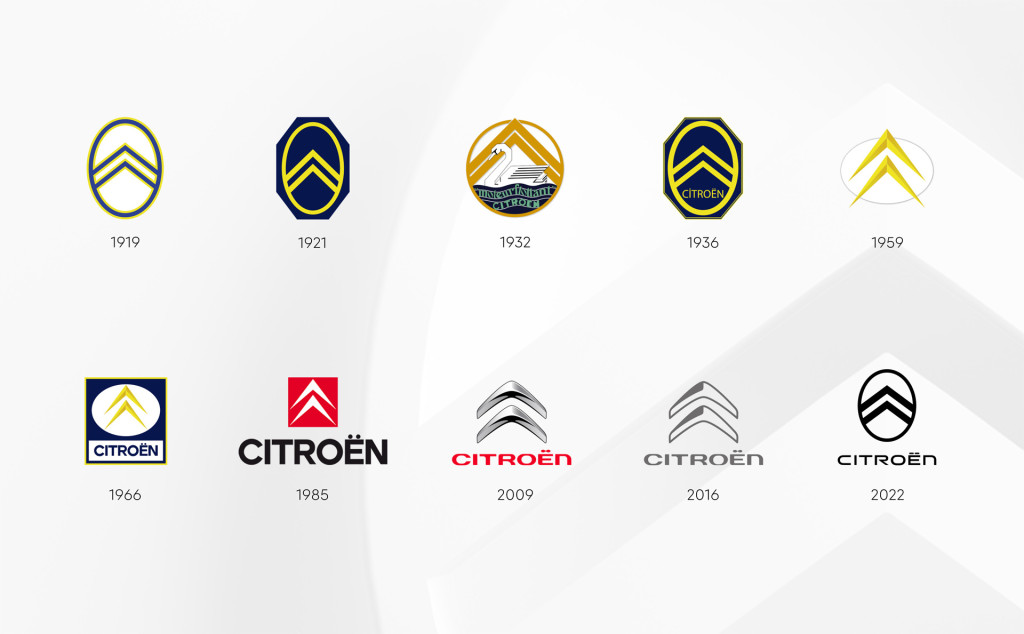
Citroën's logo has actually changed many times throughout history, and the latest version, the 10th iteration, is actually a recreation of the original design introduced in 1919.
The history behind Citroën's logo stems from one of the automotive world's greatest innovations, and one that is still used in almost every car on the road today: the helical gear. Prior to the advent of the helical gear, transmissions were much more difficult to use and were generally unreliable. On top of this they were noisy and made the driving experience uncomfortable for both drivers and pedestrians.
Citroën logo
The helical gear changed all this, and gave us the smooth power transfer between gears we're used to today. The logo resembles the herringbone pattern of a double helical gear. According to Citroën, company founder André Citroën came up with the logo after being inspired by his original metalworking company which produced double helical gears.
Citroën's new logo is being introduced to mark the automaker's changing focus away from internal-combustion cars and toward electric mobility. There will also be a new slogan, “Nothing Moves Us Like Citroën,” as well as a new typeface to appear in all digital material, including in the infotainment system of Citroën cars.
Other automakers that have recently changed their logos include Buick, General Motors, Lotus, Mini, Nissan, and Volkswagen.
